Squarespace Showcase Edit 04: Backwater Norfolk
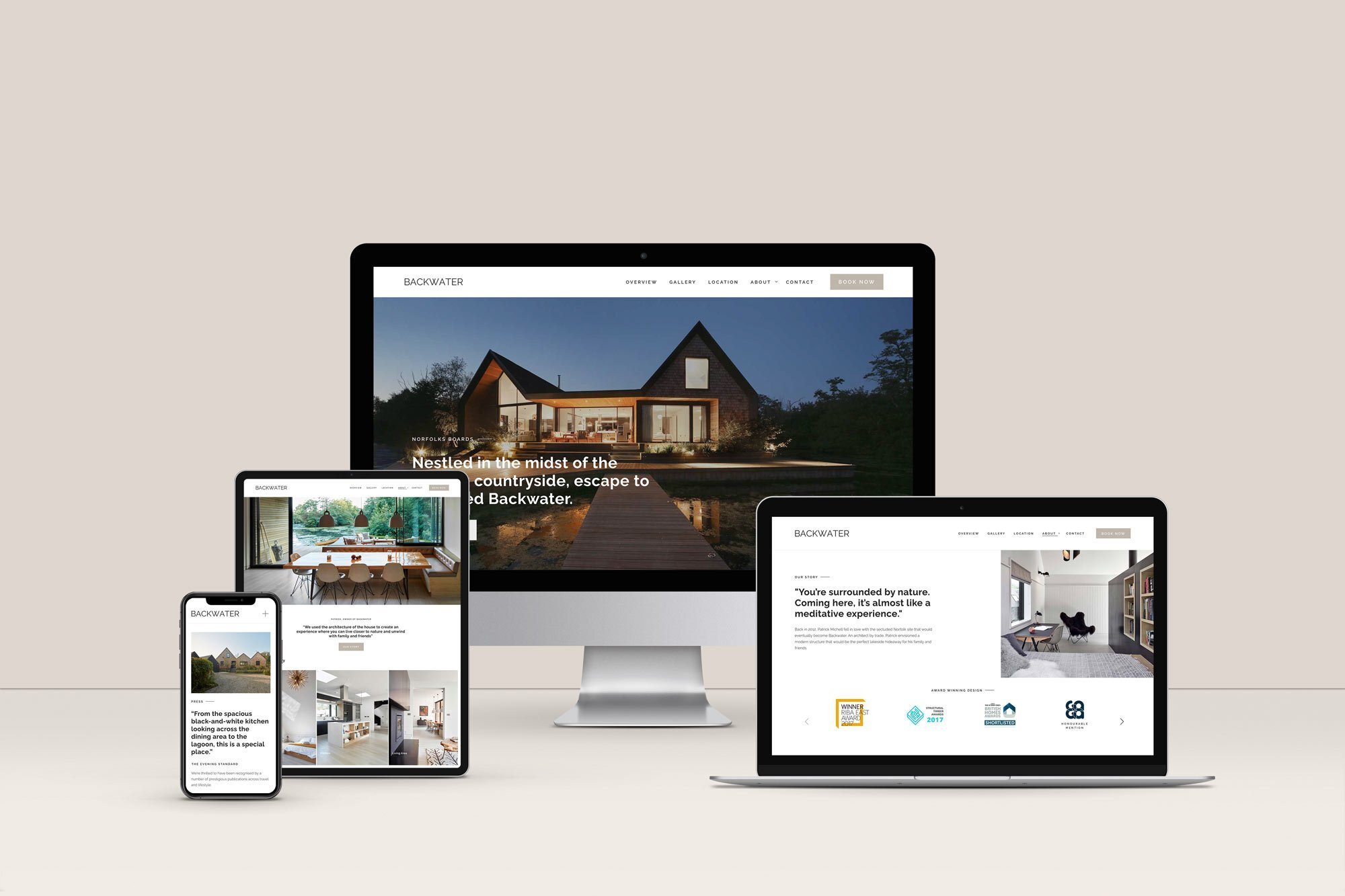
Studio 77 was excited to work with Backwater on a complete Squarespace website redesign.
Backwater is a luxury waterside escape, nestled in the unbroken countryside of the Norfolk Broads Wetlands, crafted by ambitious architect Patrick Michell.
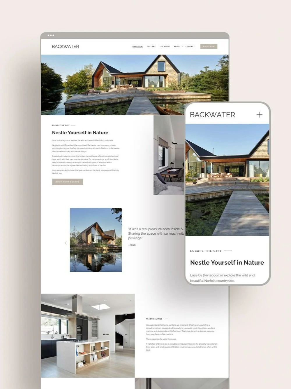
Away from the hustle and bustle, Backwater is a calming nature spot for busy professionals looking to unwind. The brand reached out to Studio 77 to design a website which reflected their sophisticated brand essence and presented their property with clarity and elegance to match their customer's experience.
A user experience to mirror the retreat experience
Before jumping into the design phase, Studio 77 always begins with a process of rediscovery: to get to the core of who a brand is, understand their target audience, and identify what they're hoping to change. This process means we can understand how to most truthfully amplify the brand's message.
Ultimately, we're looking to understand the spark of passion and authenticity which fuels a brand, which becomes the flame powering our design, lighting up a brand's identity.
For Backwater, there were some key insights we used as pillars in our design process:
For Backwater, a key deliverable was to create a website which reflected the craftsmanship, magnificence and tranquility of the retreat.
A picture speaks a thousand words
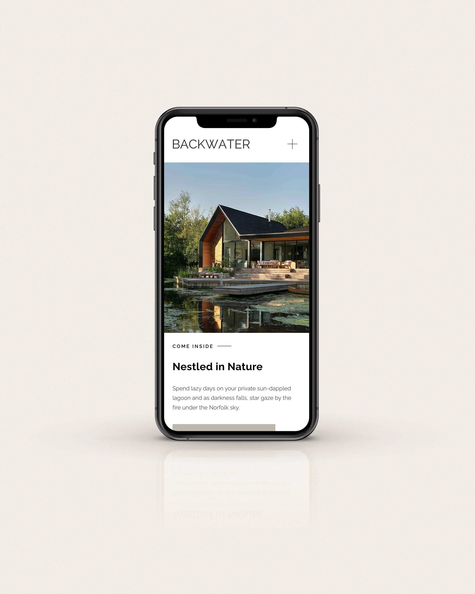
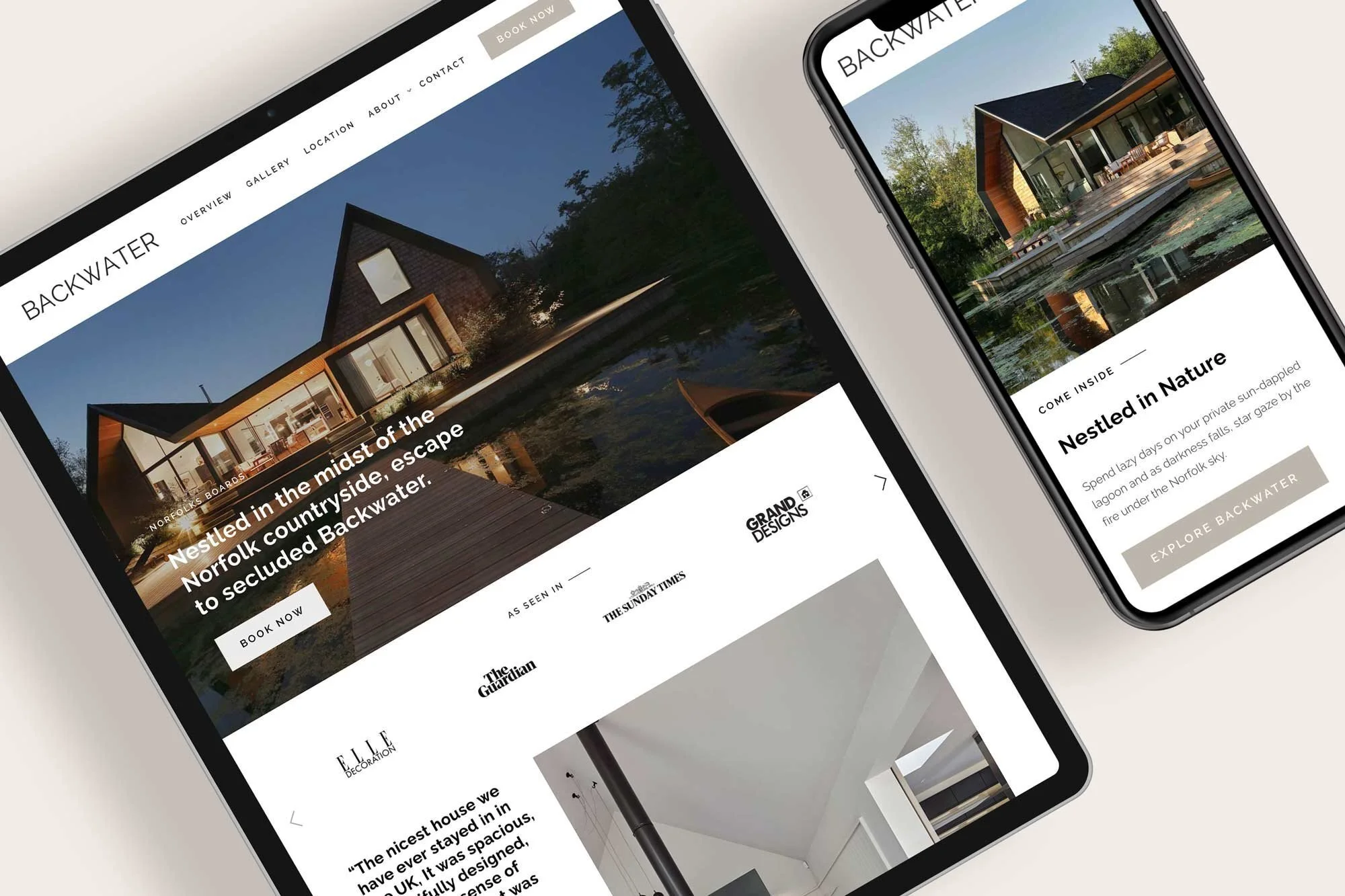
As the architecture was so breath-taking, we knew the website would be visually-led.
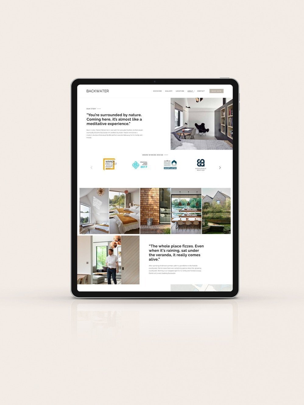
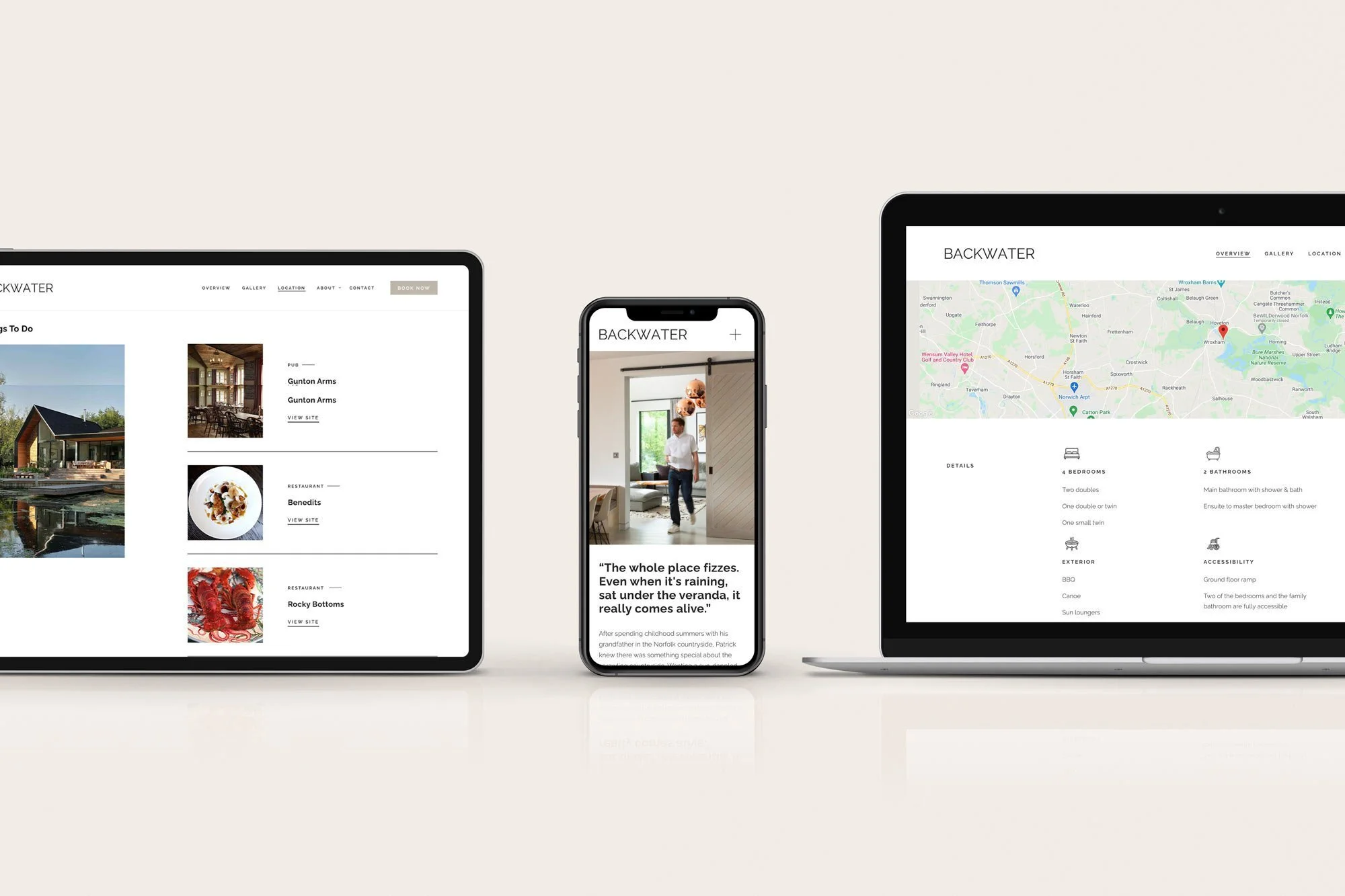
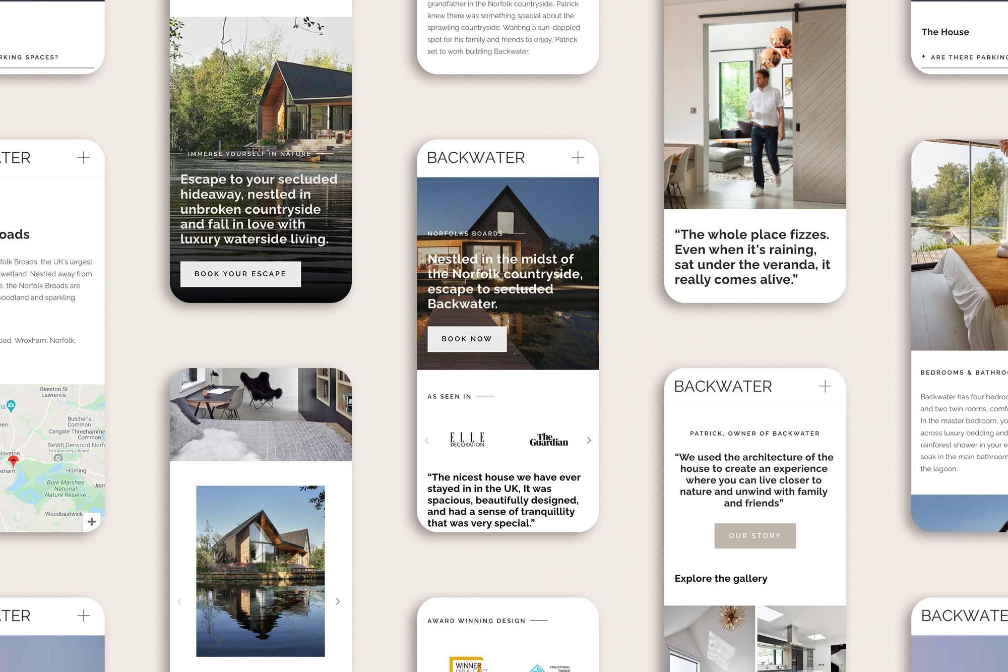
To induce a feeling of class and luxury, we opted for a clean and minimalist design which allowed the images to take centre stage. We ensured the stunning photography was upfront and inviting throughout the website, supported by alluring copy which further brought customers mind's eye into the stunning space. And to make sure no stone was left unturned - we added a gallery page to allow prospective customer's to explore every detail of the waterside wonder.
Calming Design
Backwater's intention is to give their customers a taste of a slower life, rooted in nature. As a result, it was important for the website's design and user experience to reflect their brand essence, and give prospective customers a sense of what they could expect from a stay at Backwater.
Studio 77 worked with Backwater to refine their colour palette, matching the colours exactly to the earthy shades of paint and timbre used in the retreat's design, ensuring consistent branding and subtly linking the website experience to the daily life of a Backwater guest.
We also added tasteful movement to the site, by including sticky scrolling sections which elegantly animate the website and hold the user's attention as they focus on the beautiful photography and imagine their future experience with the brand.
Further, we used delicate and airy icons on the overview page to reflect the bright, spacious feeling of the waterside home.
Clarity & Ease of Information
Another key insight was that the website needed to operate functionally - answering questions and reducing admin for the team by clearly displaying information and seamlessly funnelling customers to booking a stay - without friction.
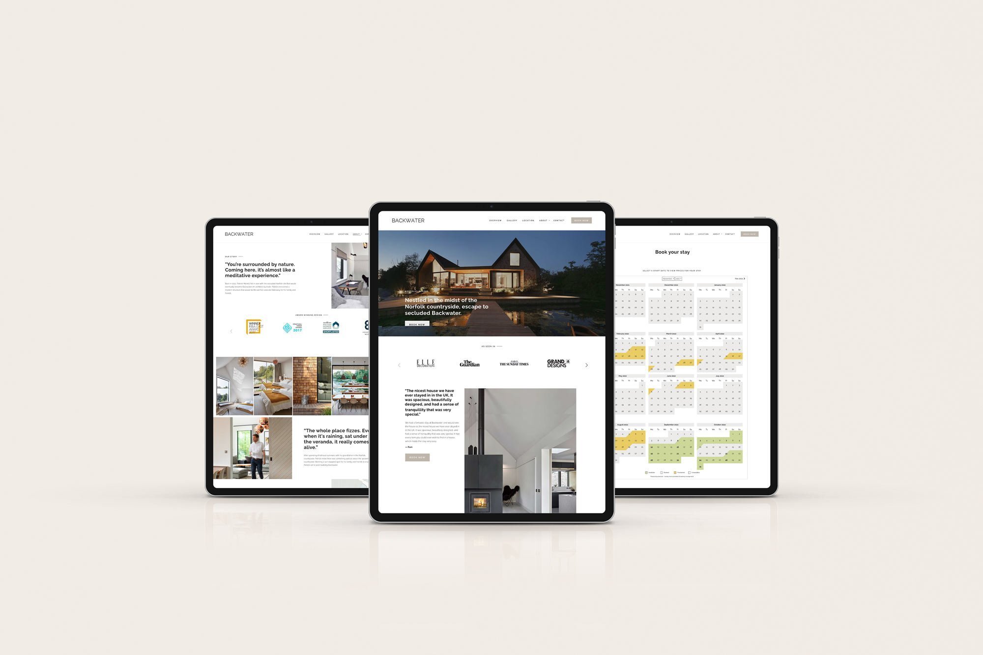
Studio 77's first challenge was to redesign a booking system, from their clunky old version, to a slick and effortless alternative. Using code to ensure the system was on brand, we integrated a new system called 'Book a Let' to improve the customer flow.
We also needed to ensure the website contained answers to their common customer queries. So, we integrated a FAQ page and a thorough overview section to include all the fine print. The FAQ page was designed with a dropdown box, to reduce the messy appearance of having too many words. The overview page was visually-driven, supported with iconography, testimonials, and calls to action to keep the page aesthetically appealing.
Social Proof to Elevate the Brand
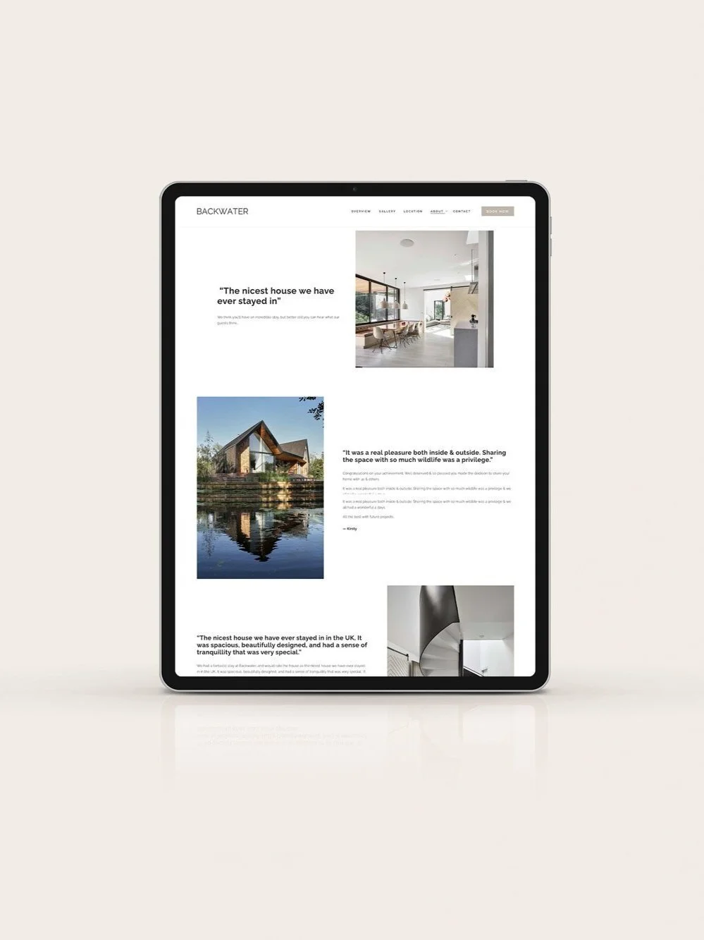
An important strategy for Backwater was to allow their reputation to build trust with future clients, through the social proof from reputable press, and impressive testimonials.
Backwater has been featured in sought-after publications, such as Elle Decoration, Grand Designs & The Sunday Times - thus it was important for the design feature their PR front-and-centre, to elevate their brand identity.
We made sure testimonials were prominent throughout the site, using larger fonts and displaying them surrounded by minimialist space in order to amplify the message.
The final website was a design which truly reflects the luxury retreat. Sophisticated, informative design, which entices their target audience's imagination into the home through stunning photography, alluring copy and calming user experience.
Bespoke Squarespace Training
We teach all of our clients how to use and update their website with our bespoke video training at the end of the project, all of our clients say how easy it is for them to update their website after the training.
We also offer Squarespace maintenance packages for those who need additional help or are too busy wearing all of the other business-owner hats.
Let’s create a Squarespace website design that you’re proud to share…
If you're interested in transforming your Squarespace website from meh to magic, then get in touch here.
Our Happy Squarespacers
Discover some of the kind words our Squarespace website designs have received below.

