branding design
Wild Nutrition
Branding design
Studio 77 was thrilled to work with organic vitamin supplement brand, Wild Nutrition, to provide a brand refresh. Wild Nutrition wanted to update their outdated feel and better reflect their predominantly female audience.

Project overview
What makes Wild Nutrition unique, is that their supplement pills use vitamins and nutrients which are harvested organically from fruits and vegetables, rather than being created in a lab like most of their competitors. Previously, their branding used garishly bright colours which obscured their natural offering.


“To illustrate an organic yet premium brand, less is always more.”
ruby lee - creative director

Our brand design approach
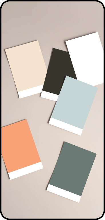
Previously, their branding used garishly bright colours which obscured their natural offering. Taking inspiration from mother nature, we reflected their wild brand essence by using subtle natural colours. We chose a broad palette, from simple charcoal black to a splash of organic zest with a peach orange. Yet we made sure every choice imitated the natural world. Our image guidelines reflected a healthy, outdoor lifestyle using natural light and a calm feel to embody the natural core of the brand.

Minimalistic branding


To illustrate an organic yet premium brand, less is always more. So, everything we designed was minimalistic. The fonts we used were simple, letting the natural product speak for itself. The design was spacious, inviting a feeling of stillness, and the understated appearance provides a sophisticated feminine feel.
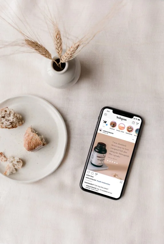
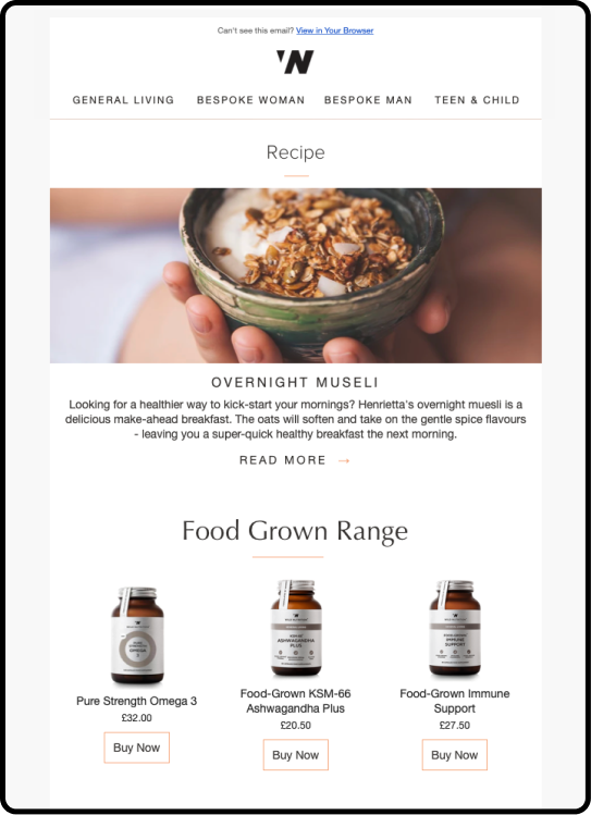
As well as delivering a full brand guidelines document, we also created social posts, email templates and business cards. We ensured the social content and email design featured the products to make their proposition clear, featuring call to action ideas and testimonials to add credibility and excitement to the brand. We kept the business cards simple, allowing Wild Nutrition's logo, (where the W and N initials combine into one letter) to breathe, and used a white background to inspire the organic and innocent elements of the brand.

Imitating the natural world
Taking inspiration from mother nature, we reflected their wild brand essence by using subtle natural colours, we made sure every choice imitated the natural world. Our guidelines reflected a healthy, outdoor lifestyle using natural light and a calm feel to embody the core of the brand.

New brand typography for health and wellness company, Wild Nutrition
The Optima typeface is a clear and precise font designed by the renowned type designer Hermann Zapf. Optima was inspired by classical Roman inscriptions and is distinguished by its flared terminals – the ends of letters. The curves and straights of the Optima fonts vary minutely in thickness to provide a graceful and clear impression to the eye.
The contrast between the Optima and Proxima Nova creates a balanced and soft visual hierarchy. Proxima Nova combines humanistic proportions with a geometric appearance.
Shopify website design mockups
Once the branding was complete, it was important to reflect this on their Shopify website. We created some minimal and conversion-focused mockups for their Shopify development team to work from when it came to the website. We focused on showcasing the abundance of 5-star reviews their products have, as well as clearly explaining the product benefits and introducing the founder to create a trustworthy customer experience.

Your dream health and wellness brand and website design is just a Zoom call away.
If you have a one-of-a-kind business and you’re looking for a brand and website to match, we’re here for you! Get in touch with our expert design team today, and let’s start your creative journey together.

