Brand bootcamp
Uhuru Botanicals branding bootcamp
Uhuru Botanicals Natural and Organic skincare range was inspired by a mothers search for soothing skincare products for her baby daughter Lulu, who had eczema. Unable to find anything suitable, founder Neo began making her own skincare products for her family using the purest Shea Butter as the base ingredient and combining it with natural botanical oils from Africa.
Project overview
We worked with organic beauty company Uhuru Botanicals to refresh their brand with one of our branding bootcamps.
With their logo already defined we focused specifically on curating a colour palette, establishing a clear font hierarchy and designing labels for their beauty products.
“Ruby and team did a brilliant job. I’m super happy with my new product labels. Thank you!”
NEO CHATYOKA, FOUNDER OF UHURU BOTANICALS
Choosing a colour palette that reflected Uhuru’s natural, African roots was key for the brand. For the primary palette we curated organic colours such as white, which is associated with safety, cleanliness and purity, which are three critical pillars of the brands’ products, a soft green, with a calming and neutral feel to it, African Sun yellow, which is bright, warming and friendly, and also this vibrant yellow shade is found occurring naturally in some indigenous plants, and a dark green to root the palette.
Beauty brand colours
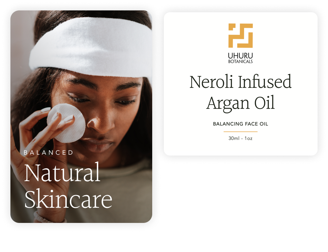
Minimalistic skincare label designs and branding
We used a minimal yet premium design style on the labels of Uhuru Botanicals natural skincare products to mirror the minimalist ingredients of the products.
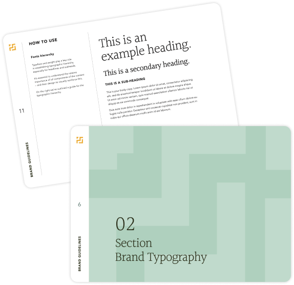
New brand typography for beauty brand, Uhuru Botanicals
Choosing refined typography for Uhuru Botanicals was one of our main focuses. We chose a serif font for the headings, as they are associated with premium, luxury brands. We chose ‘Halant’ as the main heading font as it has a fresh, modern look and feel. The little details throughout the font give it character and originality, and the lightweight of the font creates a beautiful, feminine feel, which was integral for Uhuru's aesthetic.
We partnered the heading font with a clean, easy-to-read sans-serif font. Typeface and weight play a key role in establishing the typographic hierarchy, especially for headlines and subheads which we needed to create for the packaging labels that we created. It’s essential to understand the relative importance of all components of the content – and then design to visually reinforce this, so we outlined this in the brand guidelines for Uhuru.
Beauty brand design
Your dream beauty brand design is just a Zoom call away.
If you have a one-of-a-kind business and you’re looking for a brand to match, we’re here for you! Get in touch with our expert design team today, and let’s start your creative journey together.


