signature brand + web package
My Veggie Bubba signature branding and website design
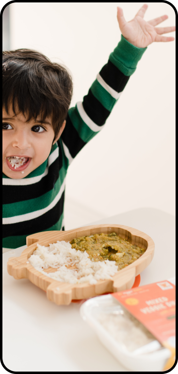
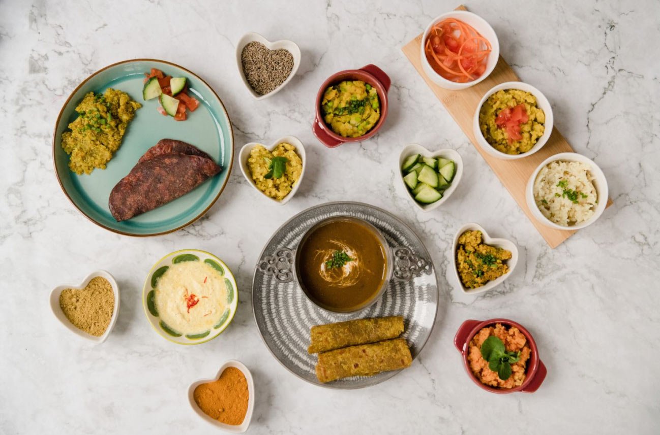
My Veggie Bubba creates authentic, nutritious Indian-inspired plant-based meals for babies and toddlers, making mealtime healthy & easy. Founder, Nital, bought us on to create a new brand, complete with packaging, print and a Shopify website design.
Project objectives
Create delicious, Indian inspired meals for babies and toddlers that are quick for parents to make.
Create a visually compelling and strategic brand that creates memorable mealtimes for families.
Have an established brand presence that is recognisable and visually different from other children's meals.
Nital took care of the creating meals side of the brand mission, whilst we used our strategic brand design skills to work on curating the visually compelling brand, that is different and stands out from the crowd.
“Ruby has brought my vision of my business to life. She understood from the very first meeting what I wanted to create and understood the business fully. Her standard of work is phenomenal and she met every deadline.”
NITAL RUPARELIA, MY VEGGIE BUBBA FOUNDER
Our brand design approach
As with all branding projects, we started our brand design by deep-diving into the types of consumers that we were aiming to attract to My Veggie Bubba. The overall results were that we were attracting eco-conscious, high-achieving, vegan-curious mothers who want to make mealtime quick and easy without compromising on flavour or nutrition.
This prompted us to start looking into their shopping behaviours and brands that they already interacted with to see how we can best position ourselves to attract our target market.
The logo design
We use two typefaces in the logo, which we use throughout the brand, this helps to get customers used to seeing the brand application.
The dot of the 'i' is a 24 spoked star, also known as the Ashoka Chakra which is featured in the flag of India, and we added glyphs to the 'Y' and the 'A' to mirror the flourishes that you see in Sanskrit to reflect the brand’s heritage.
As well as this we used a child-like handwritten font for the word 'veggie' - this is a nod to the age of the children, and how they are learning to write in cursive at pre-school. We didn’t divulge fully down the handwritten route as we still wanted to maintain an elegance to the brand that would appeal to the target market.
On the full-colour logo, we’ve used a mix of all of the brand colours, again to get the customers used to seeing the bright, bold and vibrant colours which will be used elsewhere in the brand.
Brand colour palette
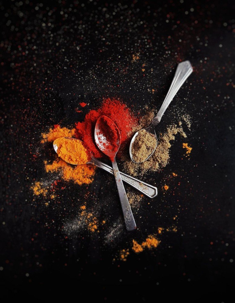
The colour palette that we used was indicative of the flavours and the spices used within the products, which each colour being named after an ingredient.
We had bay leaf, cumin, saffron, turmeric and coconut making up the main palette, with supporting tints and shades of those colours used throughout the brand application to allow some flexibility within the palette.
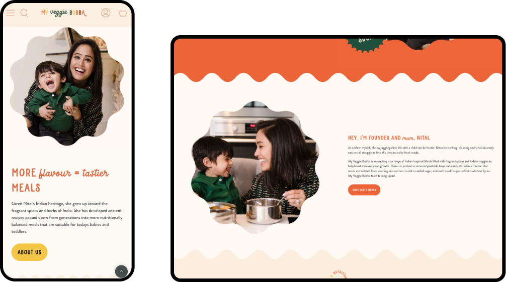
We used bright colours to help the packaging and the designs stand out on the shelf, as well as to create a bold visual design on the Shopify website that we created for the brand as well.
Typography for children’s food brand, My Veggie Bubba
The fonts that we’ve used throughout the brand are playful and full of character, but still, retain the high-value brand aesthetic that we were going for.
We used a combination of printed and script fonts in the titles, using the script font as an accent to highlight key words or phrases within a sentence. This contrast helps identify the key phrases within the packaging and on the Shopify website at a quick glance.
For our body copy, we used Brandon Grotesque, a classic yet characteristic sans serif font that’s easy to read and readily available on most web browsers for a consistent brand experience.
Conversion-led, bespoke Shopify website design
As My Veggie Bubba was selling their meals online, we knew that we needed to choose a strong e-commerce platform that could handle large orders and lots of traffic, so we decided to build the site on Shopify.
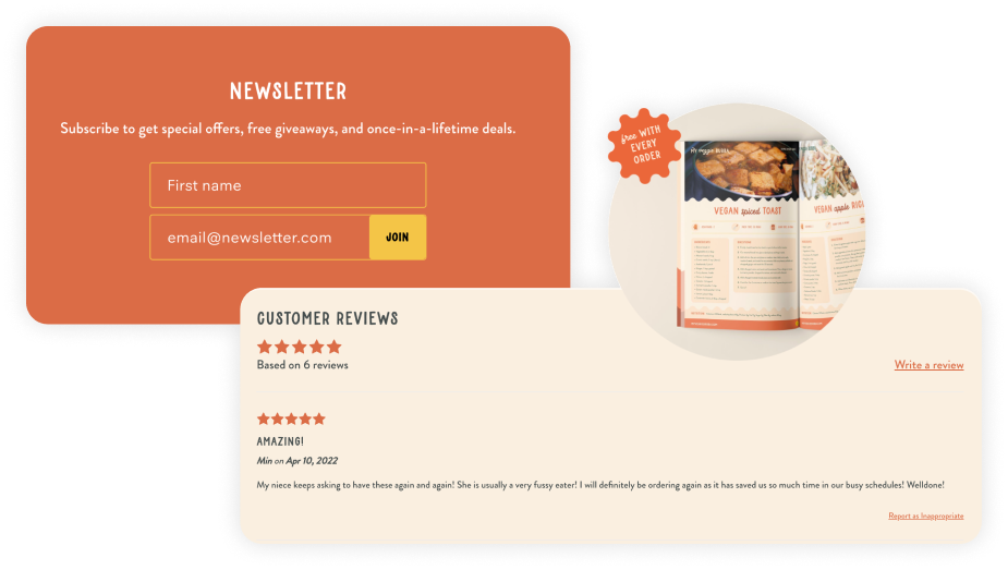
Our main focus with the Shopify website design was to encourage people to sign up to the mailing list, and then purchase some of the products from the site. From our initial brand research, we knew that we needed to showcase reviews, recipes and the founder and mum, Nital, to build trust with her audience.
On the product pages we used a sticky add to cart button so that as the user scrolled through the page, the main call to action was clear and visible at all points.
Shopify website design for children’s food brand, My Veggie Bubba
We also created a recipes blog, which provides easy, Indian-inspired plant-based meal ideas to parents, as well as being used as an SEO anchor to increase traffic to the website. We created a pop-up that is used as a data capture and gives users 10% off their first order, as well as putting them into an email marketing flow, where after purchase, they get an additional discount code to use on their next purchase.
Shopify website design strategy
We made sure to showcase photos of Nital and the chief My Veggie Bubba taste tester Josh, her son, to make sure that people know that all the meals are mum-made and tried and tested at home first, before being turned into easy and delicious meals for other parents to enjoy.
The end result was a strategically designed brand and website, which both the client and My Veggie Bubba customers are delighted with.
Bespoke Shopify Training
We teach all of our clients how to use and update their Shopify website with our bespoke video training at the end of the project, all of our clients say how easy it is for them to update their website after the training.
We also offer Shopify maintenance packages for those who need additional help with their site.
Your dream food business brand and website design is just a Zoom call away.
If you have a one-of-a-kind business and you’re looking for a brand and website to match, we’re here for you! Get in touch with our expert design team today, and let’s start your creative journey together.


