brand refresh + web package
Glioblastoma Research Organization brand and website design
The Glioblastoma Research Organization, or GBMRO, is a research charity in the US dedicated to helping treat those with glioblastoma and championing the warriors who have it. Our job was to create a brand identity update and website design for this incredible charity.
Project objectives
In the strategy session, we found terrific cohesion between the user and business goals to achieve a fantastic website. The website had to be an easy place for people to donate, share their stories and feel like a part of a greater community.
The other key goal was to demonstrate what incredible work GBMRO projects are doing and the life-saving effects they’re having on true “warriors”.
Working with Ruby and her fantastic team has been an absolute pleasure. As a Miami-based PR professional, I didn't notice the time difference since her team was always on it! I look forward to working with Studio 77 again soon.
agustina, head of pr for gbmro
Brand colour palette
Standing out from the crowd is essential for the young, change-making team that runs GBMRO. Whilst the cause is serious, the people who run the non-profit are fun and full of zest. We didn’t want a colour palette that looked like every other non-profit out there.
Keeping a dark navy in the palette was important to have something to root the rest of the punchy colours. While we wanted a vibrant palette to represent hope, joy, and how we are making a difference, we also recognise the severity of a glioblastoma diagnosis.
Bespoke Squarespace website design
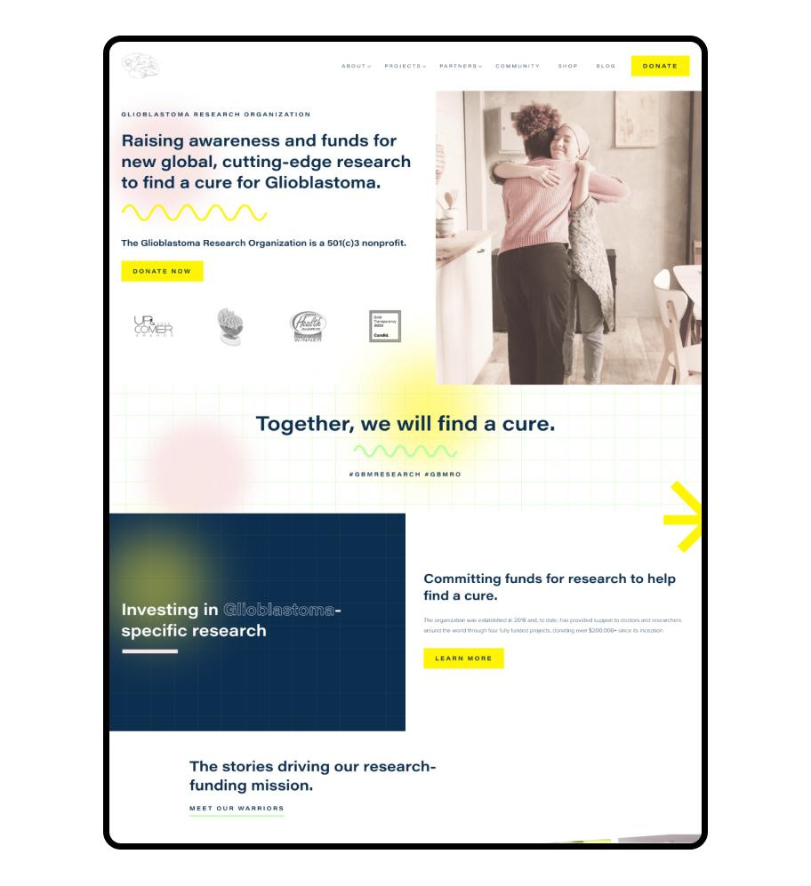
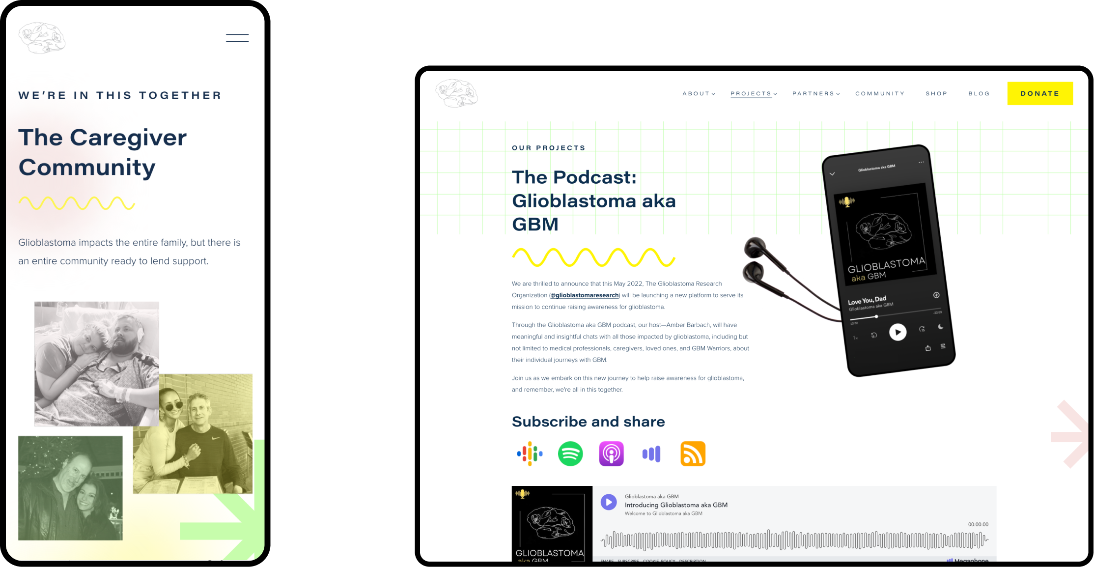
The GBMRO website aimed to both shout about the incredible stories of people in its community with glioblastoma and educate and inform about the seriousness of the illness.
During our strategy sessions, we uncovered that this is a young team striving to do all it can for people from all walks of life. It’s a website that should inspire hope and admiration for what the charity is doing and, in turn, receive more donations.
Focusing on the warriors
Previously a big focus of the old site was on copy and information, which, whilst valuable, didn’t really shout about the fantastic things the charity was doing or the remarkable stories of its community.
In the new website design, we’ve used branded illustrations and put the most prominent focus on the photos of glioblastoma “warriors”. This adds that human touch to the website, which helps people connect more emotionally to the charity, resulting in more donations.
Educating users on how they can help the cause
A vital goal of the new website design was to increase donations to support the charity. We achieved this by having the first call to action on the home page under the charity's mission statement, above their awards, and next to a moving image to immediately connect with the visitor about how professional, powerful and essential these charities' work is.
As well as a donate button in the header for ease of access on each page, we also created an engaging, colourful way of educating visitors on all methods of donating.
Squarespace Training
We teach our clients how to use and update their websites with our bespoke video training at the end of the project; it's important that they know how to edit and maintain their websites themselves. Our clients often say updating their websites after the training is simple and easy to do.
We also offer Squarespace maintenance packages for those needing additional site help.
Your dream charity website design is just a Zoom call away.
If you're interested in creating a magic, memorable, money-making charity website and brand, get in touch with one of our team today.


