Why Your Logo Isn't Your Brand
“I just want a logo designed.”
A request that as designers we have heard a countless number of times. Although it is an innocent request, its one that we answer “no” to - and here’s why: your brand identity is so much more than your logo, its an experience.
The first, and most natural thing, that comes to most peoples minds when asked what brand identity is, is the logo. While your logo is indeed an integral part of your business and your brand, in the grander scale of things, it’s just the tip of the iceberg.
Brand identity (also known as branding, corporate identity, visual identity, brand image and probably 84 other wishy-washy names) is how your customers perceive your brand. It’s how you represent yourself to your audience, not only visually but also from a strategic perspective.
Without getting into the full nitty-gritty of business strategy (we could write a whole blog post on that alone), your business strategy should be completed before you even get onto the design stage of your brand identity. It’s truly your master plan; defining who your target audience is, what their pain points and desired outcomes are, what your competitors are doing right, and more importantly what they’re doing wrong.
The way that we pluck this information from our clients is through a brand questionnaire, where we ask questions that perhaps clients haven’t been asked before. It’s always a really interesting way to really understand their business, their goals, and their positioning, but it’s also super beneficial for the clients themselves. They come away with a document that they can refer to throughout their business journey, with a basic outline of their brand strategy.
Once we’ve gathered and reviewed all the information that we’ve collected from the brand questionnaire, then we can move onto the design process. Again, before we design anything, we curate a mood board to visually represent how we envision the brand looking based on the questionnaire responses.
Then we move onto the logo design itself. We always start with pen and paper, and once we’re happy with a concept, we’ll digitalise it. Creating various lock-ups of the logo (vertical, horizontal, favicon, text only, you name it, we do it) and stress-testing it. Does it look good as a favicon? Does it look good on a billboard? When the answer is yes we move onto the next point.
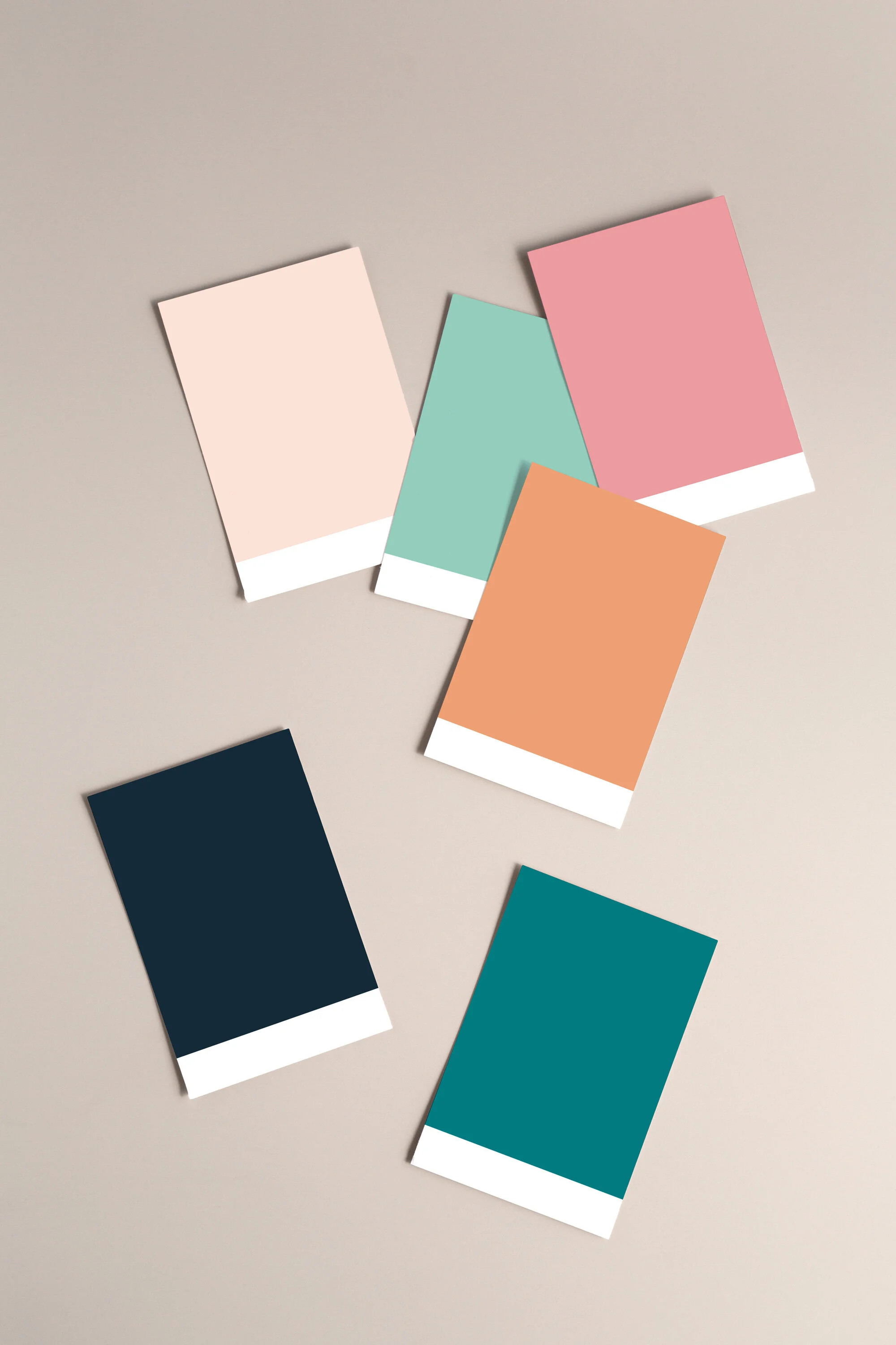
Curating Brand Colours
Crafting a relevant, visually pleasing and consistent colour palette is really valuable for your brand identity as colours communicate a lot about who you are to your clients. We draw inspiration from the mood boards that we created at the beginning of the process and any relevant information that we've received in the questionnaire.
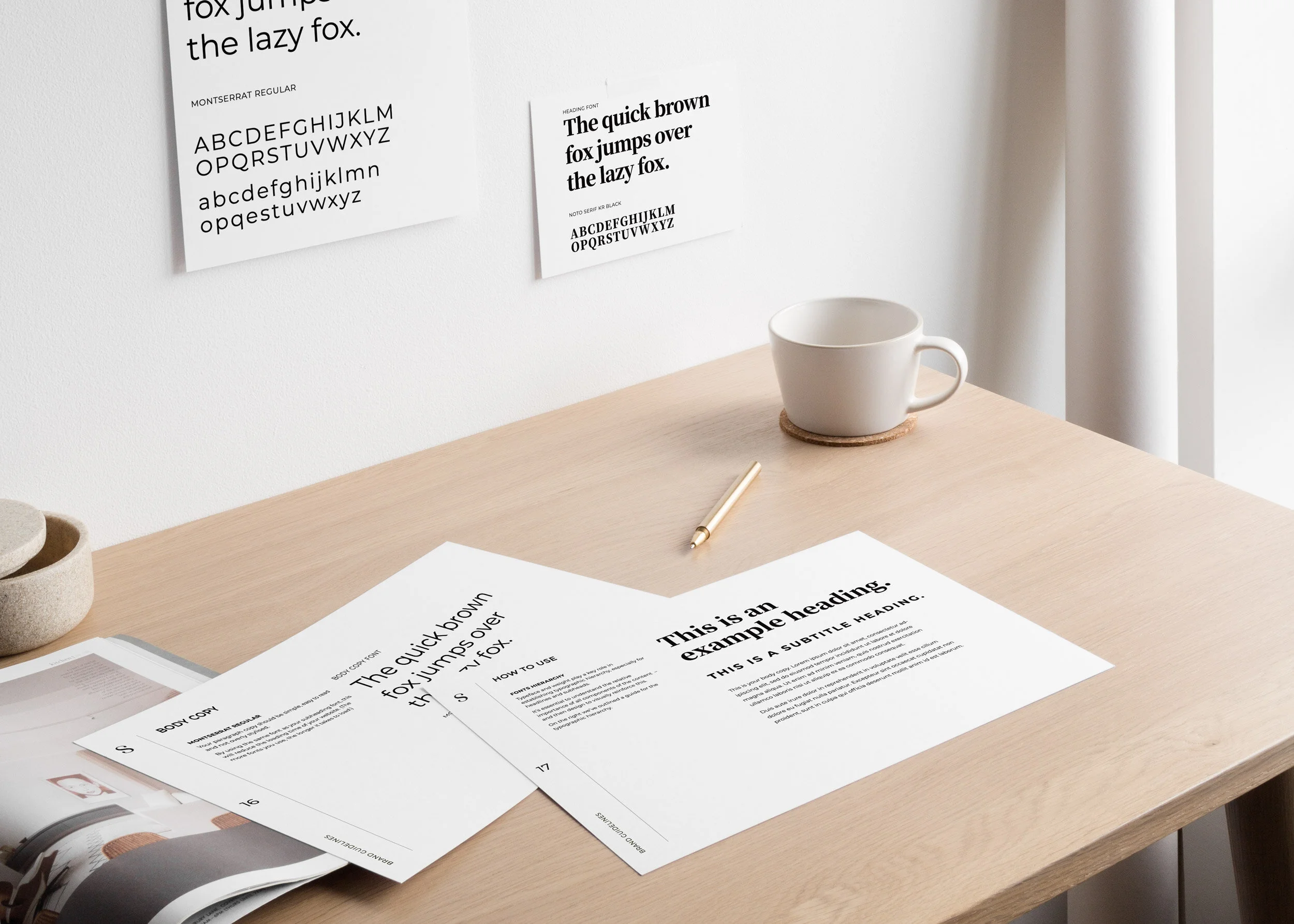
Brand Typography
Once we’ve crafted a colour palette, we move onto typography. Fonts carry a certain amount of the brands' tone of voice; it’s how customers visually take in the information they're reading.
A common misconception with typography is that you should use the same fonts that you’ve used in your logo - this is not true. The fonts that work on your logo might not work for the day-to-day job of your typography. You need clear fonts, with a clear hierarchy, which your logos fonts might not be able to carry.
Visual Brand Identity
Logo, colours and typography (developed from a brand strategy) are the basic requirements of a visual brand identity. We always create a set of brand guidelines to give to our clients once we’ve gone through this process so that they can keep their brand, well, on-brand!
Some clients have more aspects of their brand that they need developing, i.e. imagery, iconography, patterns, illustration, in which case, we would go through and develop those elements and add them into the brand guidelines as well. Each client has completely different needs to get their brand launched; there's no ‘one-size fits all' approach with branding.
When you combine a solid brand strategy with a clear visual identity, you are creating an experience for your customers. Your logo is essentially your brands signature; it’s a mark that will remind your clients of the experience and emotions that you’ve left with them.
Logos are rarely ever used without support from other visual identity elements, such as colours, fonts and imagery. And that's for a good reason - because your logo isn't your brand.
And that, my friends, is why don’t design ‘just logos’.


