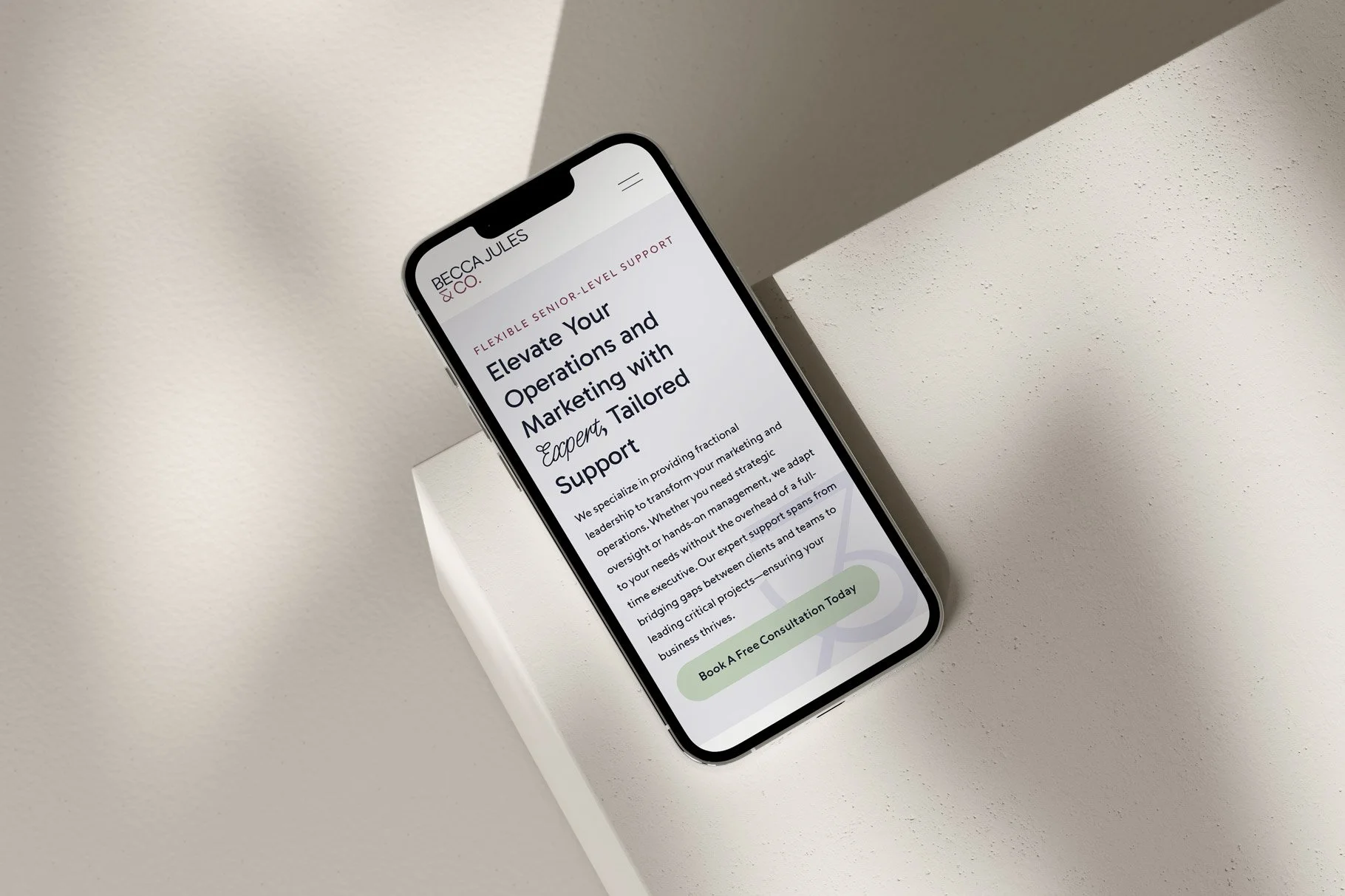
The Squarespace Showcase Edit 14: Becca Jules & Co.
Since we launched in 2017, we’ve been using Squarespace to create beautifully bespoke websites. Over the 7 years, we’ve launched countless numbers of Squarespace website designs, through both our bespoke website design and build service here at Studio 77, and also through our sister company Squarebase, which sells plug-and-go Squarespace website templates.
The Squarespace Showcase Edit 14: Becca Jules & Co.
In our 13th edition of The Squarespace Showcase, we turn our spotlight to a project that perfectly blends personality with professionalism. Becca Jules & Co, a dynamic consultancy offering marketing and operational leadership, tasked us with creating a Squarespace website that not only represents their brand but makes visitors feel right at home.
Becca Jules & Co’s Squarespace website design objectives were:
Enhance Brand Engagement: Create an inviting online space that mirrors Becca Jules & Co’s personal touch and professional expertise, encouraging deeper interaction and longer visit durations.
Showcase Services Clearly: Display the full range of Becca’s offerings in a clear, accessible format that highlights her unique approach to consulting.
Generate Leads: Design a user-friendly, high-converting website that makes it easy for potential clients to inquire about services, fostering increased business opportunities.
“Ruby and Will at Studio 77 are an absolute delight and pleasure to work with. I was constantly blown away by the amount of polish and attention to detail they displayed while executing my brand and website. Every meeting is met with a quick turnaround and something new to review. Ruby captured the essence of my brand so beautifully and fully translated who I am and what I stand for. So much so, that it brought me to tears. Working with Studio 77 means having a professional, engaging and polished product at a competitive price!”
Custom Squarespace Design Features
Becca required a new website that would highlight her diverse range of services while capturing the personal essence of her brand. Given the comprehensive nature of her offerings in consulting, event planning, and property management, we needed to strike a perfect balance between rich, engaging content and a clean, minimalist design.
Here are just some of the elements we added to the Squarespace website design:
We integrated 'sticky' sections within the Squarespace website design to seamlessly guide users through the arched, window-style imagery that offers a peek into Becca’s professional world. This encourages continued scrolling and engagement with the content.
We added subtle yet effective fade-in animations. This design choice enhances the visual appeal of the site without overshadowing the important information it conveys, ensuring Becca's personalized touch and professional services are both highlighted.
To further captivate visitors, we implemented delicate hover animations for the call-to-action buttons, These animations subtly engage users, drawing their attention to the unique services Becca offers without distracting from the overall content flow.
Custom Squarespace Website Stats
In just 1 week, we wrote over 500 lines of custom CSS code and built four pages.
Don’t forget about mobile!
We also meticulously coded the site to ensure seamless functionality on mobile and tablet devices. When employing extensive custom coding, it’s crucial to maintain Squarespace’s inherent responsiveness to guarantee a perfect user experience across all devices.
Bespoke Squarespace Training
At the project’s completion, we provided Becca with bespoke video training on how to use and update her new website. This training is designed to empower our clients, making it easy for them to manage their site independently. Of course, we're always here to help with our Squarespace maintenance packages for those who need extra support.
The Squarespace Website Design
Arched and window-style images are strategically used throughout the website to offer a welcoming peek into the life and work of Becca, creating an inviting and friendly atmosphere. These thoughtful design elements mimic the warmth and openness that Becca brings to each client interaction.
To further personalise the site, we incorporated bespoke, hand-drawn iconography. Each icon is meticulously designed to reflect the personalized touch that Becca brings to her projects, adding an artistic flair that stands out in the digital space.
The typography on the website is a careful combination of classic serif fonts and a handwritten cursive font that mirrors Becca’s actual handwriting. This choice adds a unique personal touch, making every word on the site feel as though it comes directly from her.
The colour palette is composed of soft, mature hues that convey both friendliness and sophistication, achieving a stylish yet approachable look. Subtle background elements featuring close-ups of the 'B' and '&' from the logo add movement and serve as gentle reminders of the brand’s identity.
A subtle fade-in animation enhances the user's scrolling experience, making it simple yet engaging. This effect ensures the website feels light and fresh, creating ample space for content without overwhelming visitors.
Our goal was to design a Squarespace site that allows Becca’s brand to breathe visually and narratively. By integrating full-width photos with subtly inset images and strategically placed sticky sections, we crafted a visual journey that leads users effortlessly through the site.
Care was taken to optimise each image for quick loading times and to rename files with relevant keywords to enhance SEO performance. We know that a simple contact form isn't enough to convert visitors into clients, so we placed compelling calls to action at the end of every project page to encourage more inquiries.
Let’s Create a Squarespace Website Design That You’re Proud to Share…
If you’re inspired by Becca Jules & Co’s new website and interested in transforming your own Squarespace site, get in touch here. Let’s make your digital presence as remarkable as your business.


