The Squarespace Showcase Edit 12: Applied Studio
Since we launched in 2017, we’ve been using Squarespace to create beautifully bespoke websites. Over the 6 years, we’ve launched countless numbers of Squarespace websites, through both our bespoke website design and build service here at Studio 77, and also through our sister company Squarebase, which sells plug-and-go Squarespace website templates.
We love using Squarespace as a platform to build our clients’ websites on because it’s easy for our clients to use to maintain their website, and it gives us plenty of freedom to do our thang (no that’s not a typo) with our advanced knowledge of Squarespace coding.
It really is a win-win situation!
The Squarespace Showcase Edit 12: Applied Studio
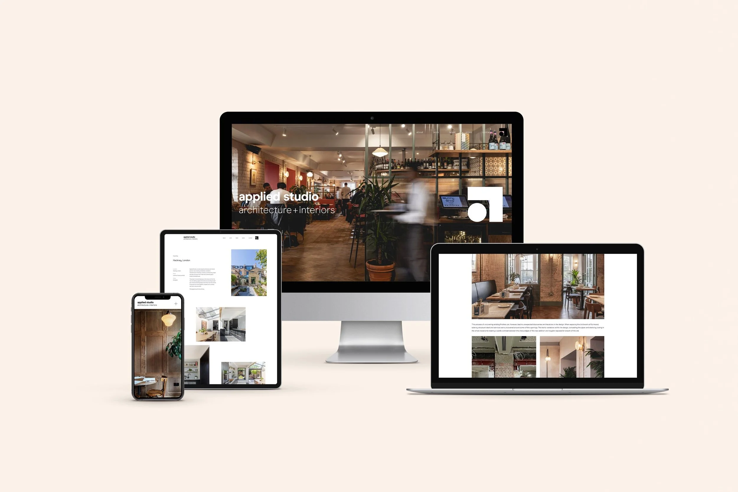
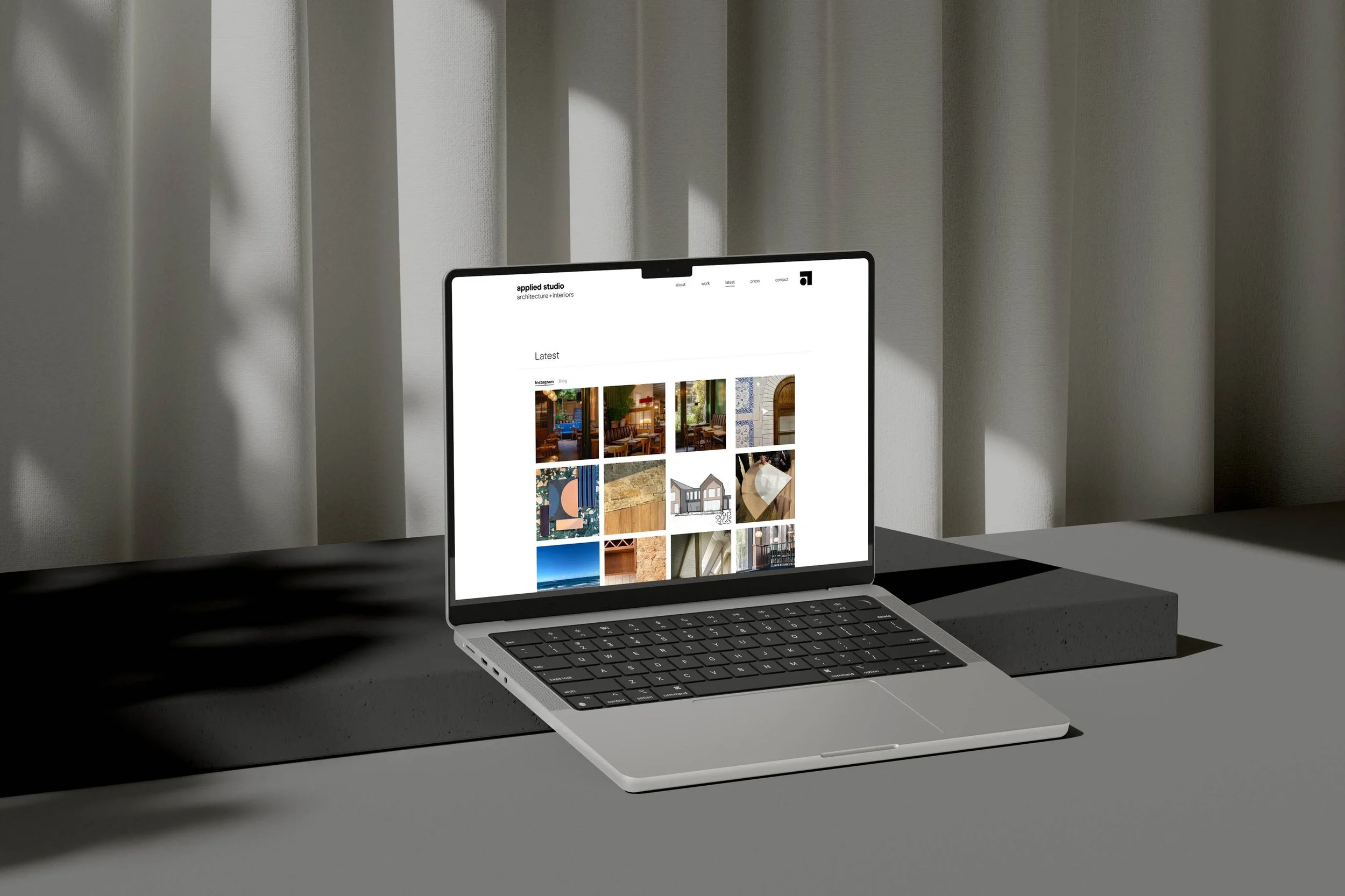
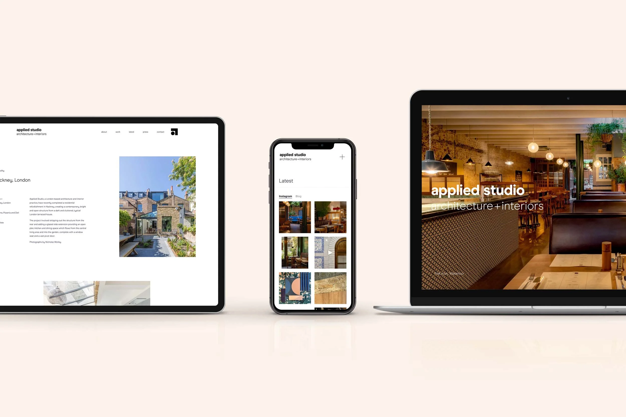
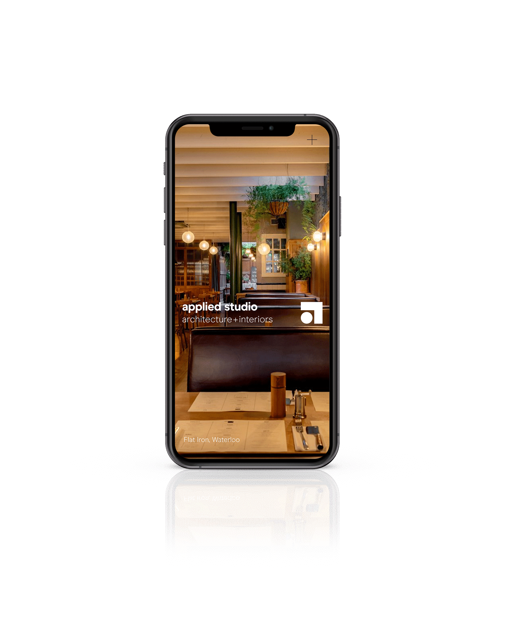
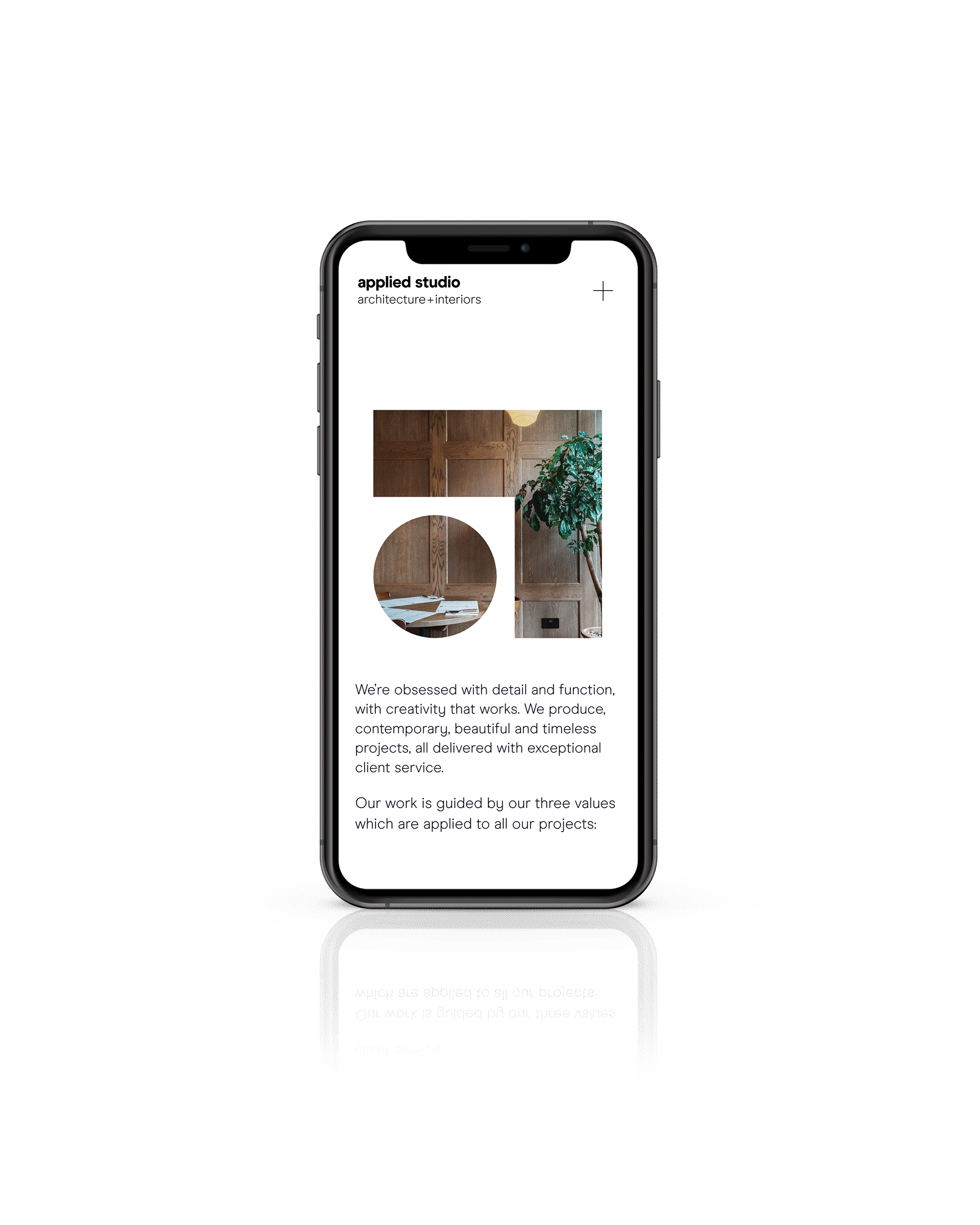
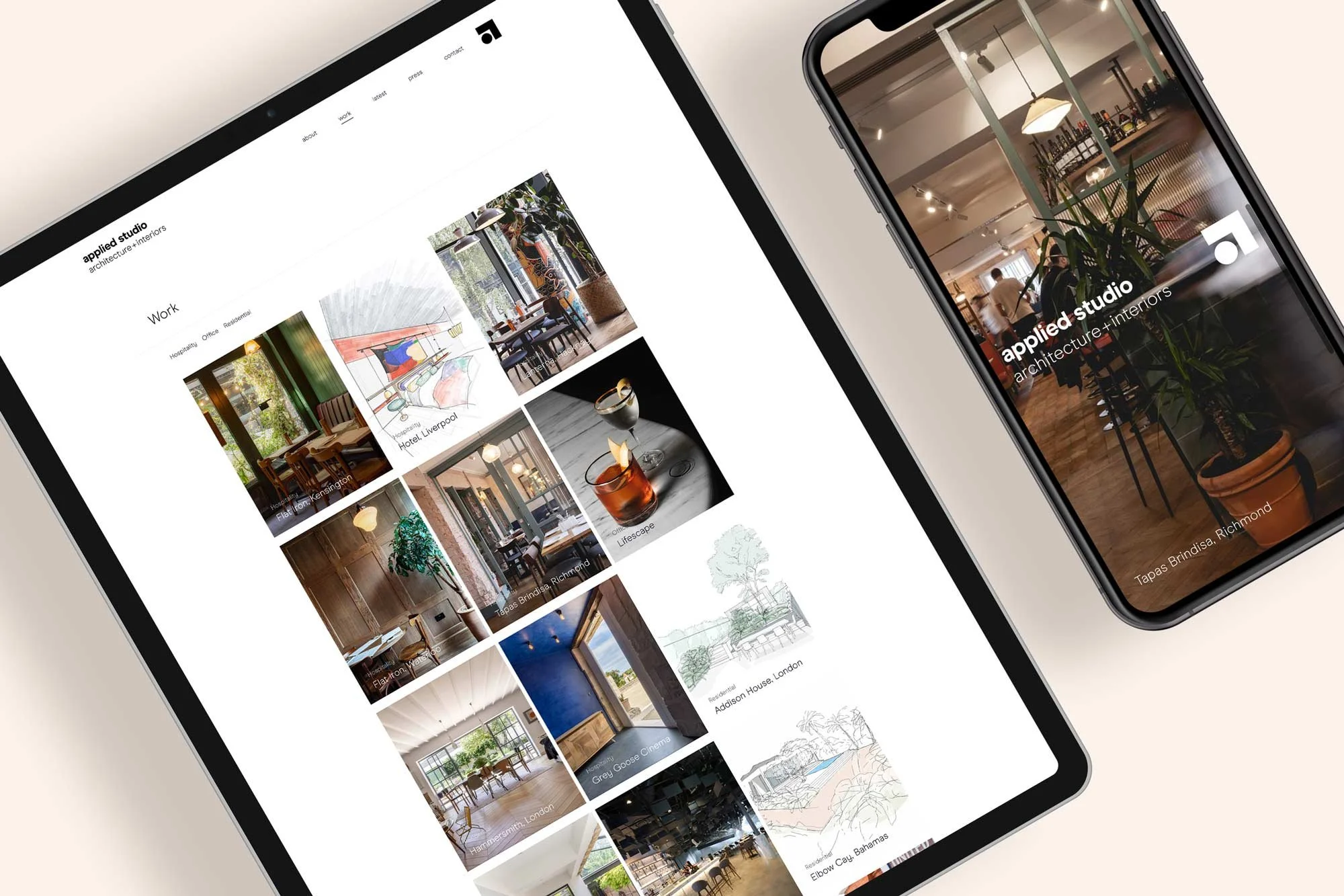
In our twelfth edition of The Squarespace Showcase, we spotlight a project for the global architectural firm, Applied Studio, based in Europe and North America. They approached us to create a Squarespace website design that showcased their brilliant work and shined a spotlight on their impressive architectural portfolio.
Applied Studio has worked with impressive clients such as Grey Goose, Flat Iron and BrewDog, so it was crucial that these projects were clear to site visitors.
Applied Studio’s Squarespace website objectives were:
Provide a digital hub featuring their entire architectural catalogue to impress potential clients.
Design sophisticated and non-distracting webpage layouts to exhibit their beautiful imagery for each project.
Create a high-converting website that engages users and encourages enquiries.
“We love our new website!”
Custom Squarespace Design Features
Applied Studio needed a new website that made their beautiful catalogue of architectural designs the star of the show. But with such an extensive portfolio, we needed to find the balance between content-heavy and minimalistic.
Here are just some of the custom elements and plug-ins we added to the Squarespace website design:
We used ‘sticky’ sections within the Squarespace website design to encourage users to keep scrolling through the smooth transitions of photos from the projects.
Added custom CSS to create an intricate but delicate-looking scroll animation so we could showcase the stunning project images without distracting site visitors from important information displayed next to them.
We used custom CSS code to create subtle animation when a portfolio item is hovered over, further engaging the user without distracting from the content.
Custom Squarespace Website Stats
In 6 weeks we wrote over 2000 lines of custom CSS code and built over twenty five custom pages.
Don’t forget about mobile!
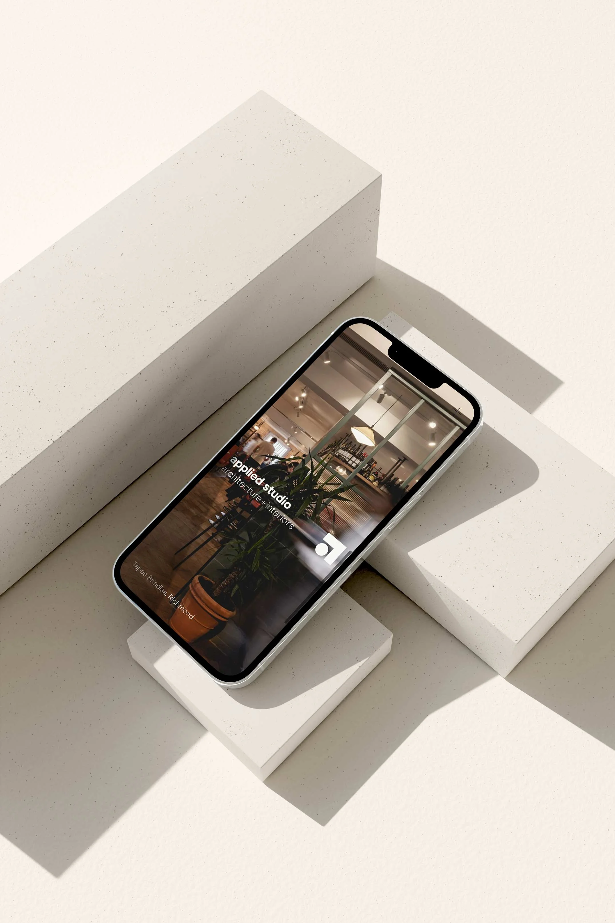
On top of this, we also added bespoke mobile code to make sure that the Squarespace website works seamlessly on mobile and tablet, as well as desktop. When using lots of custom code, it’s important to check that the website renders perfectly on mobile, sometimes the additional code snippets can affect Squarespace’s built-in responsiveness.
Bespoke Squarespace Training
We teach all of our clients how to use and update their website with our bespoke video training at the end of the project, all of our clients say how easy it is for them to update their website after the training. (Although we do offer Squarespace maintenance packages for those who need additional help or are too busy doing all of the other business-owner stuff.)
The Squarespace Website Design
Our aim for the portfolio was to craft a design that provided ample breathing room for the images while avoiding an overly simplistic or unengaging appearance.
By combining full-width photos, subtly inset images, and strategically positioned ‘sticky’ sections, we were able to skilfully lead users along the page's narrative.
Given the portfolio's extensive visual content, we took special care to resize every image. This optimisation ensured quick site loading speeds, preserving a seamless browsing experience. Additionally, we renamed image files to incorporate keywords before uploading them to boost the site's search engine optimisation (SEO) performance.
We also know that adding a contact form alone isn’t enough to encourage people to get in touch, so we added a ‘call to action’ at the end of every project page to engage the user and encourage more enquiries.
Let’s create a Squarespace website design that you’re proud to share…
If you're interested in transforming your Squarespace website, then get in touch here.

