The Squarespace Showcase Edit 10: Glioblastoma Research Organization
Since we launched in 2017, we’ve been using Squarespace to create beautifully bespoke websites. Over the five years, we’ve launched countless numbers of Squarespace websites through both our custom website design and build service here at Studio 77 and our sister company Squarebase, which sell plug-and-go Squarespace website templates.
We love using Squarespace as a platform to build our clients’ websites because it’s easy for them to use to maintain their websites. Our advanced knowledge of Squarespace coding gives us plenty of freedom to do our thang (no, that’s not a typo).
It is a win-win situation!
The Squarespace Showcase Edit 10: Glioblastoma Research Organization
In our tenth edition of The Squarespace Showcase, we spotlight the US non-profit research charity, Glioblastoma Research Organization.
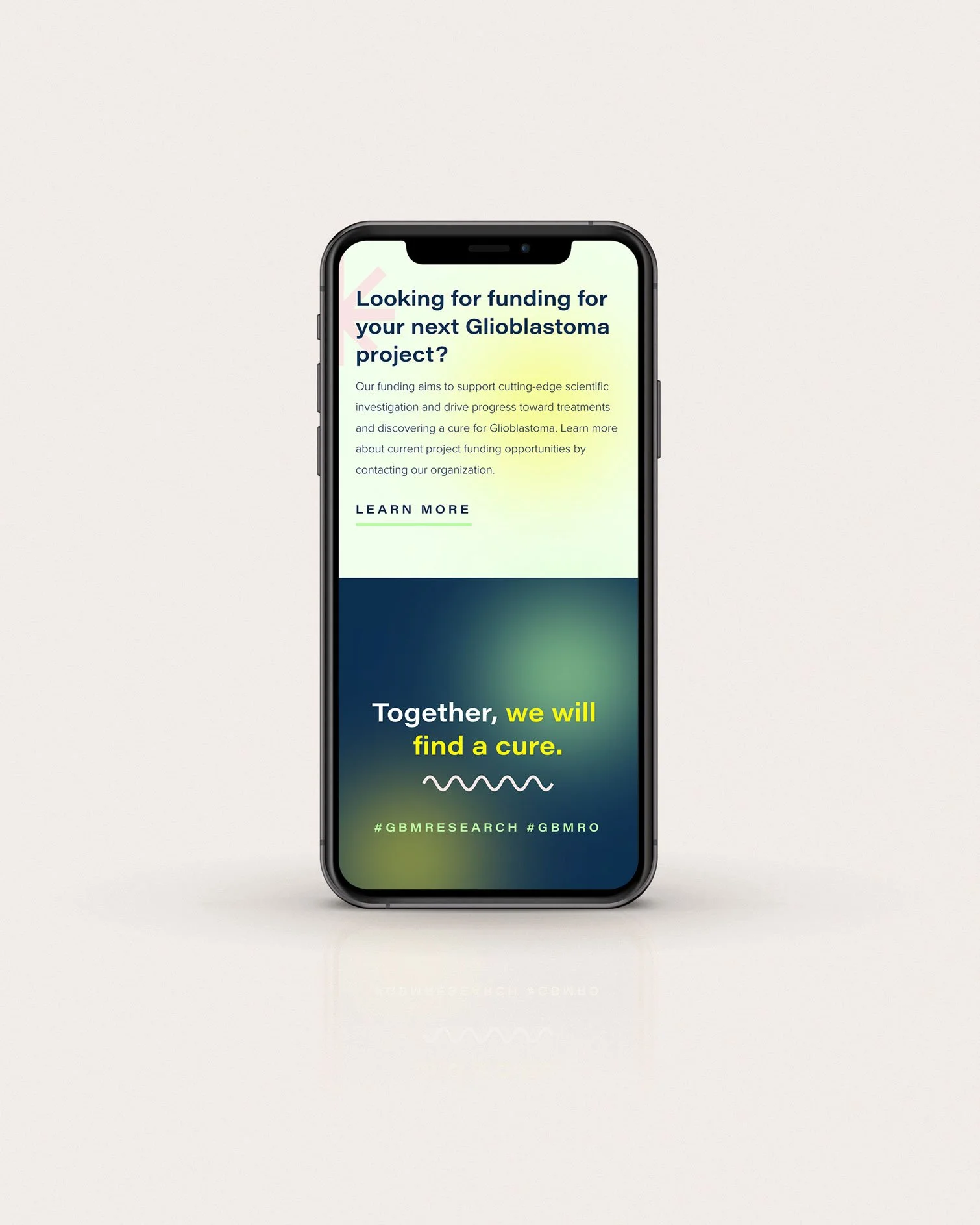
Our goal was to create a brand identity and website design that made it easy for people to donate, share their stories and feel like a part of a greater community. It was also crucial for the charity’s success to demonstrate the incredible work their projects were doing and the life-saving effects they were having on true “warriors”.
Glioblastoma Research Organization was established in 2018 and, to date, has supported doctors and researchers worldwide through four fully funded projects, donating over $250,000+ since its inception.
Glioblastoma Research Organization’s Squarespace website objectives were:
Create a design that makes it effortless for people to donate.
Champion survivors and ‘warriors’ by creating dedicated sections to their stories.
Design a website that showcases the charity’s projects and successes.
Build a brand that stands out from the crowd and reflects the zesty and positive attitude of the team.
“Working with Ruby and her fantastic team has been an absolute pleasure. As a Miami-based PR professional, I didn’t notice the time difference since her team was always on it! I look forward to working with Studio 77 again soon.”
Custom Squarespace Design Features
Behind Glioblastoma Research Organization is a young team striving to do all it can for people from all walks of life. It’s a website that should inspire hope and admiration for what the charity is doing and, in turn, receive more donations.
Here are just some of the custom elements and plug-ins we added to the Squarespace website design:
Added and layered grid lines, radials and illustrations into sections using CSS and Psuedo background elements.
Created an angled draggable “Film-strip” with alternating colour overlays displaying the warriors.
Hubspot integrated to boost newsletter signups.
Custom Squarespace Website Stats
In 4 weeks, we wrote over 2500 lines of custom CSS code and built and designed fifteen custom pages.
Don’t forget about mobile!
On top of this, we also added custom mobile code to make sure that the Squarespace website works seamlessly on mobile, tablet, and desktop. When using lots of custom code, it’s essential to check that the website renders perfectly on mobile; sometimes, the additional code snippets can affect Squarespace’s built-in responsiveness.
Bespoke Squarespace Training
We teach all of our clients how to use and update their website with our bespoke video training at the end of the project, all of our clients say how easy it is for them to update their website after the training. (Although we do offer Squarespace maintenance packages for those who need additional help or are too busy doing all of the other business-owner stuff.)
The Squarespace Website Design
The GBMRO website aimed to both shout about the incredible stories of people in its community with glioblastoma and educated and inform them about the illness's seriousness.
While we wanted a vibrant palette to represent hope, joy, and how we are making a difference, we also recognise the severity of a glioblastoma diagnosis. Keeping a dark navy in the palette- along with neat typography- was essential to have something to root the rest of the punchy colours.
Steering away from large chunks of copy and information, we've used branded illustrations and put the most prominent focus on the photos of glioblastoma "warriors". This helps people connect more emotionally to the charity, resulting in more donations.
We focussed heavily on the ease of donation by having the initial call to action right on the home page under the charity's mission statement and above their awards, including a donate button in the header for ease of access on each page and also creating an engaging, colourful way of educating visitors on all methods of giving.
Let’s create a Squarespace website design that you’re proud to share…
If you're interested in transforming your Squarespace website, then get in touch here.


